Crooked Media
Content Strategy
User Experience
Design
After our success with VoteSaveAmerica, we partnered with Crooked Media again to re-design their website and work closely with their design director, Jesse McLean, to help expand their new brand in the digital space.
Our focus was to showcase Crooked as a broader multimedia company, poised to play a different role after the 2020 election.

More Than The Pod
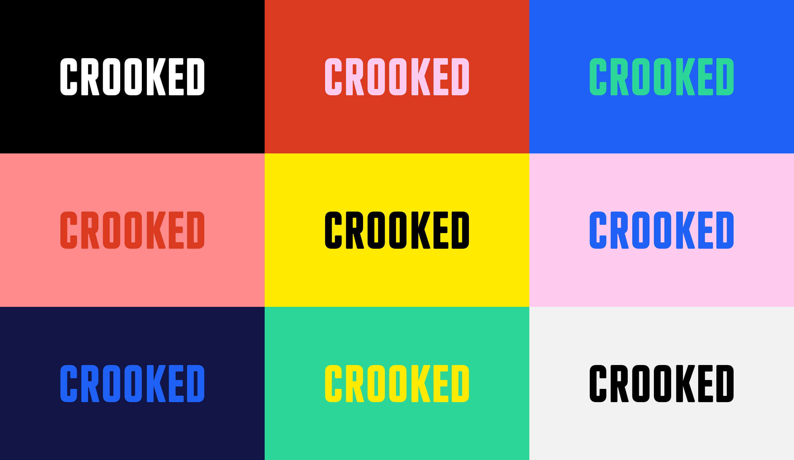
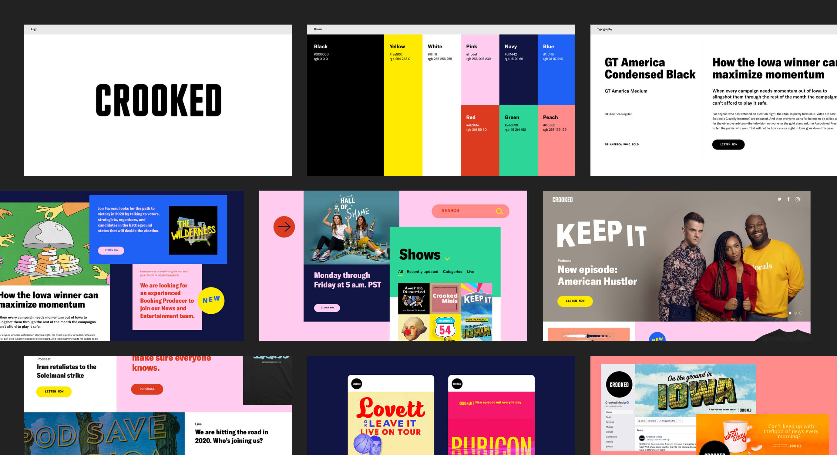
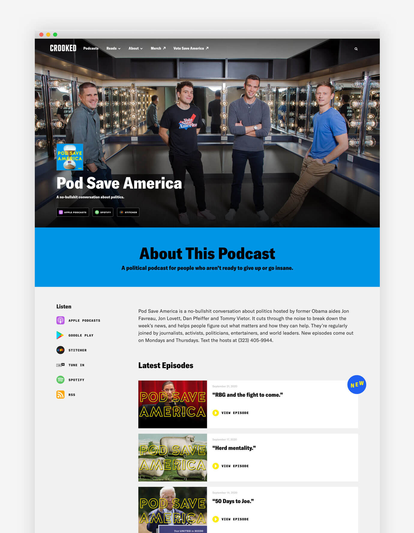
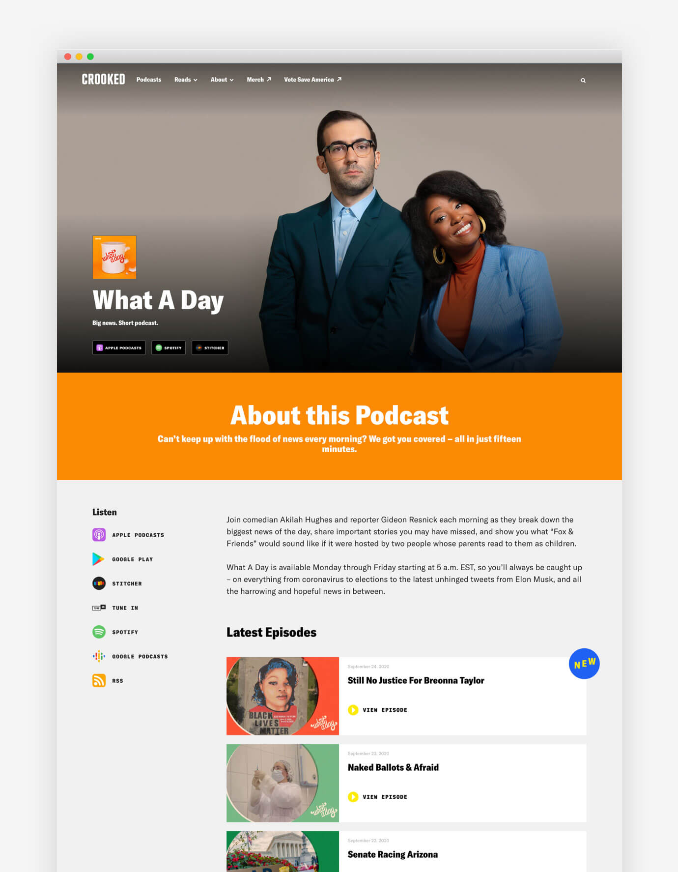
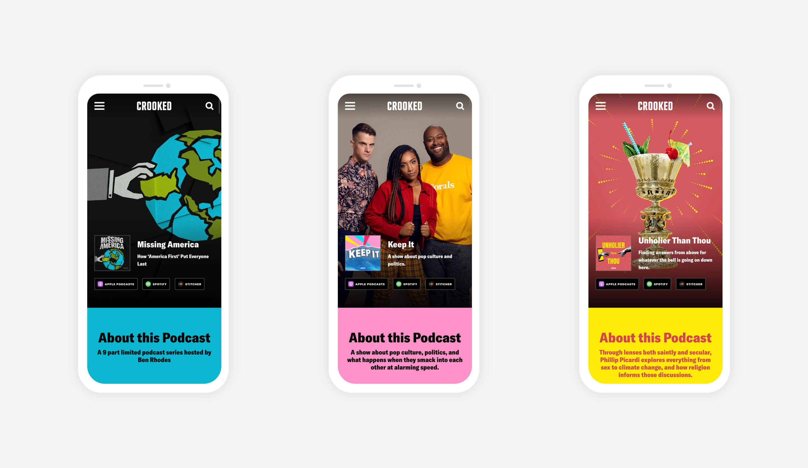
We developed a vibrant, a-political color palette that highlighted the unique aspects of each show, and created a set of modules to tie each show to actionable content, such as donations and events.
Newsletters
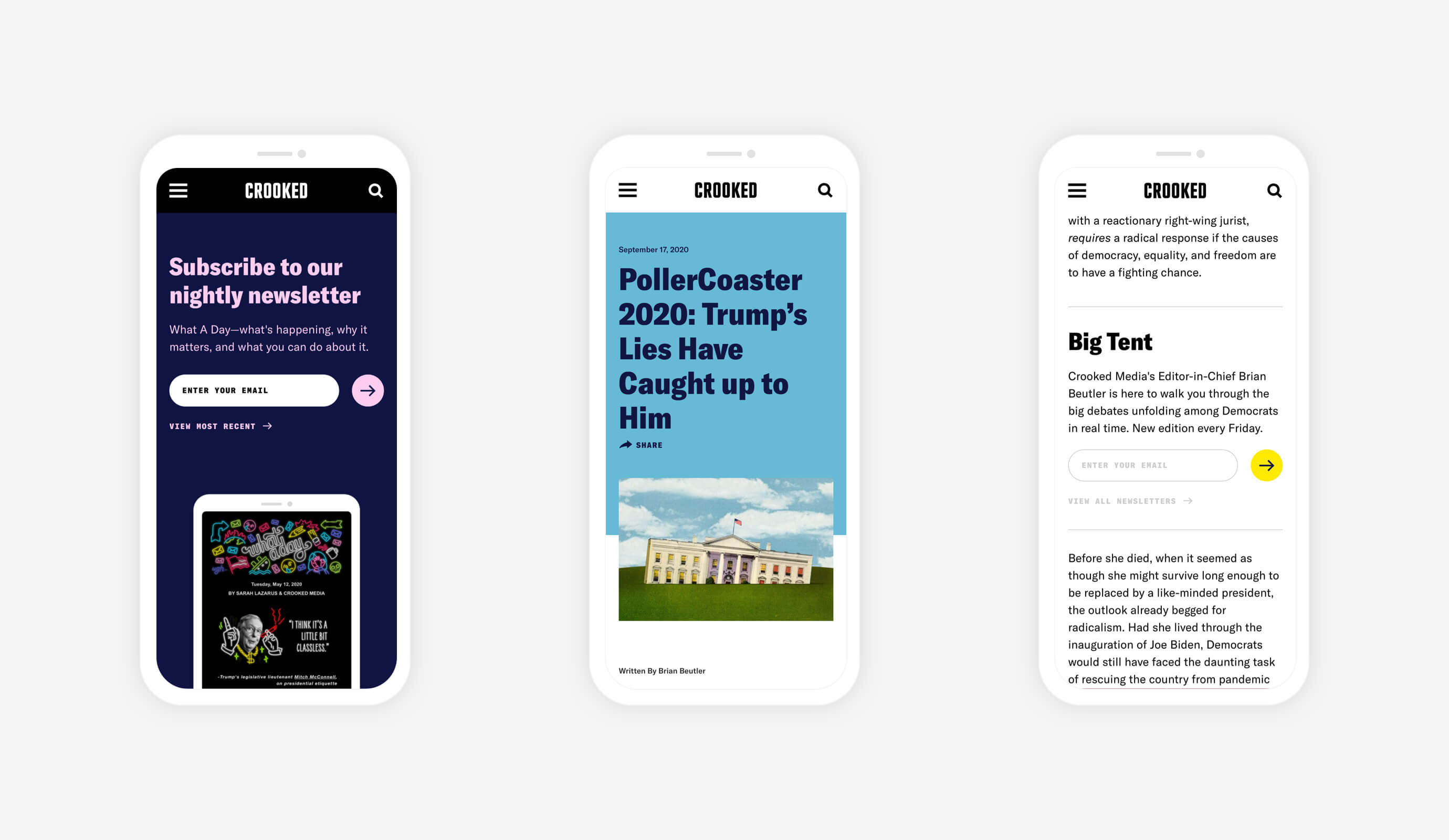
We also expanded the presence of newsletters across the site using contextual placements within podcasts, articles, and other content types to expand the connection between listeners and Crooked's written content.
This project was done as an add-on to our work with Crooked for VoteSaveAmerica. The team was quite small, where I acted as the sole designer for the project in addition to my normal role as creative director.
Creative Director
Matt Hallock
Project Management
Sarah Ramanuj
Design & UX
Matt Hallock, Aaron Wachsstock
Development
Stefan Kaltenegger, Byron Briceño