BCG Henderson Institute
Content Strategy
User Experience
Design
The BCG Henderson Institute is a platform for the latest in premium editorial content from Boston Consulting Group. The Henderson Institute delivers curated, cutting-edge thinking, and eschews constant stream of click-bait stories, favoring instead a smaller number of thoughtful, worthwile articles and collections on topics.

What's Worth Reading
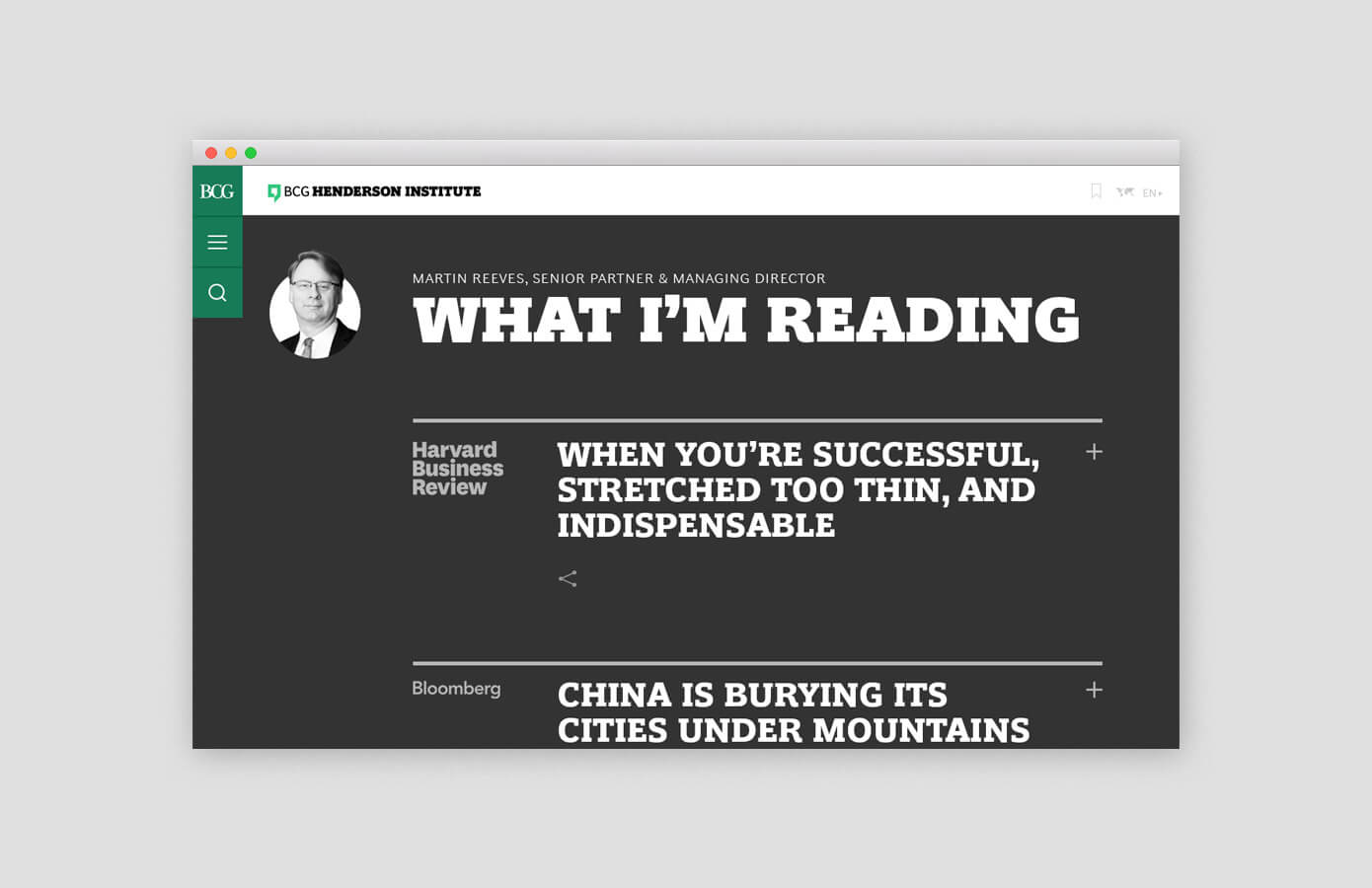
The core insight showed our primary audience was frequently short on time and stuck in a sea of low quality content, making it difficult to judge what was worth reading.
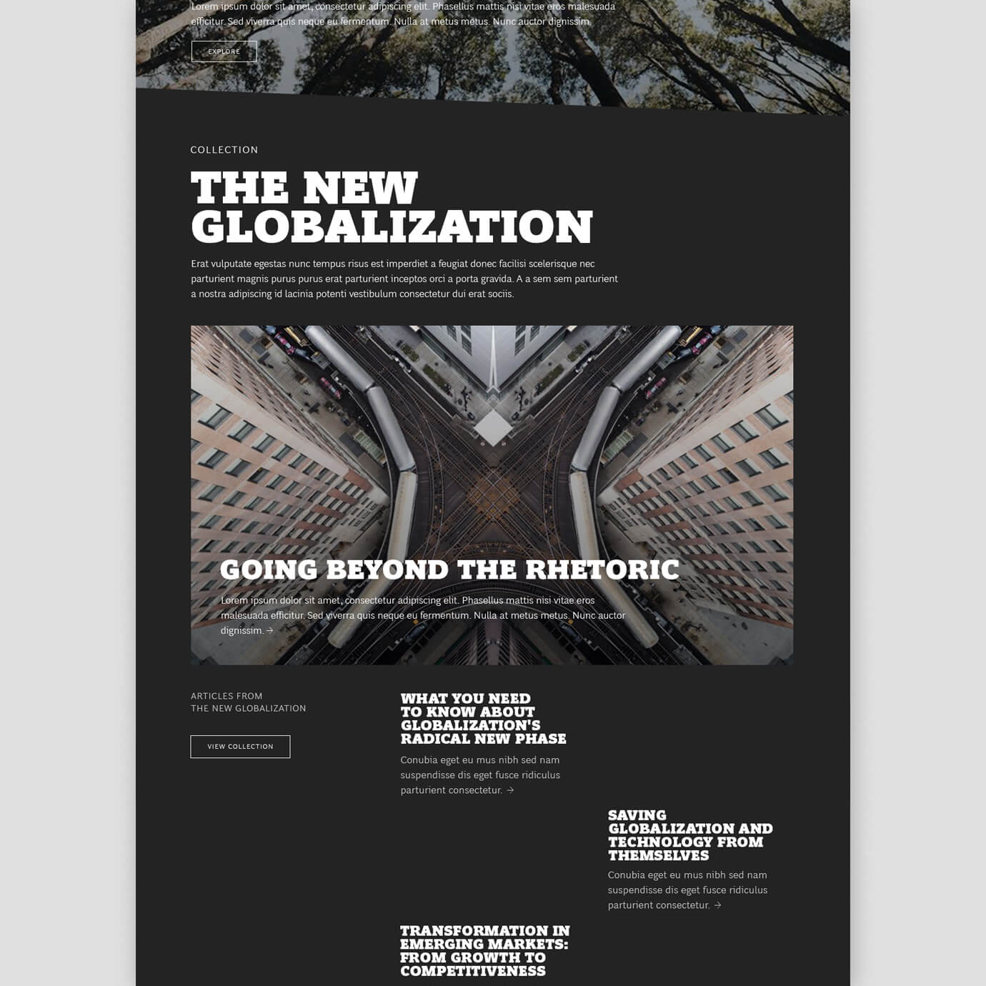
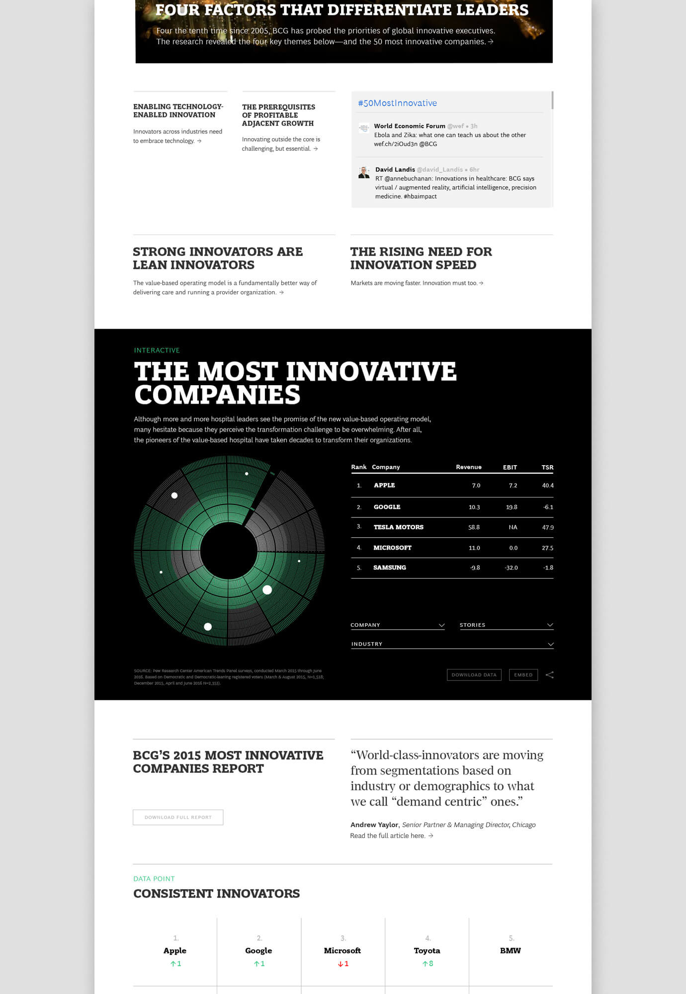
Our strategy focused on creating quality long-form articles and collections, bundles of shorter articles, video, and infographics around a bigger theme built in a modular way.

Distraction Free Reading
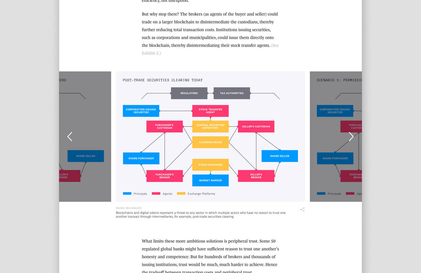
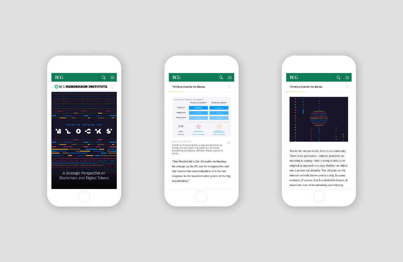
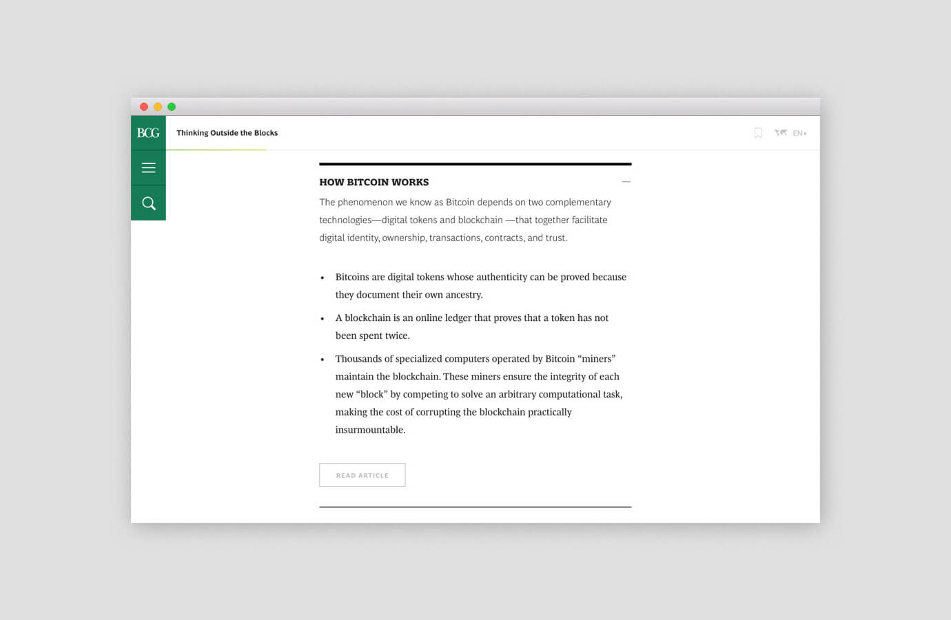
The overall layout of the articles is intended to encourage completion: a progress bar helps the user track where they are, bookmarking saves their point across devices, users can toggle text size, and the margins are kept clutter-free.
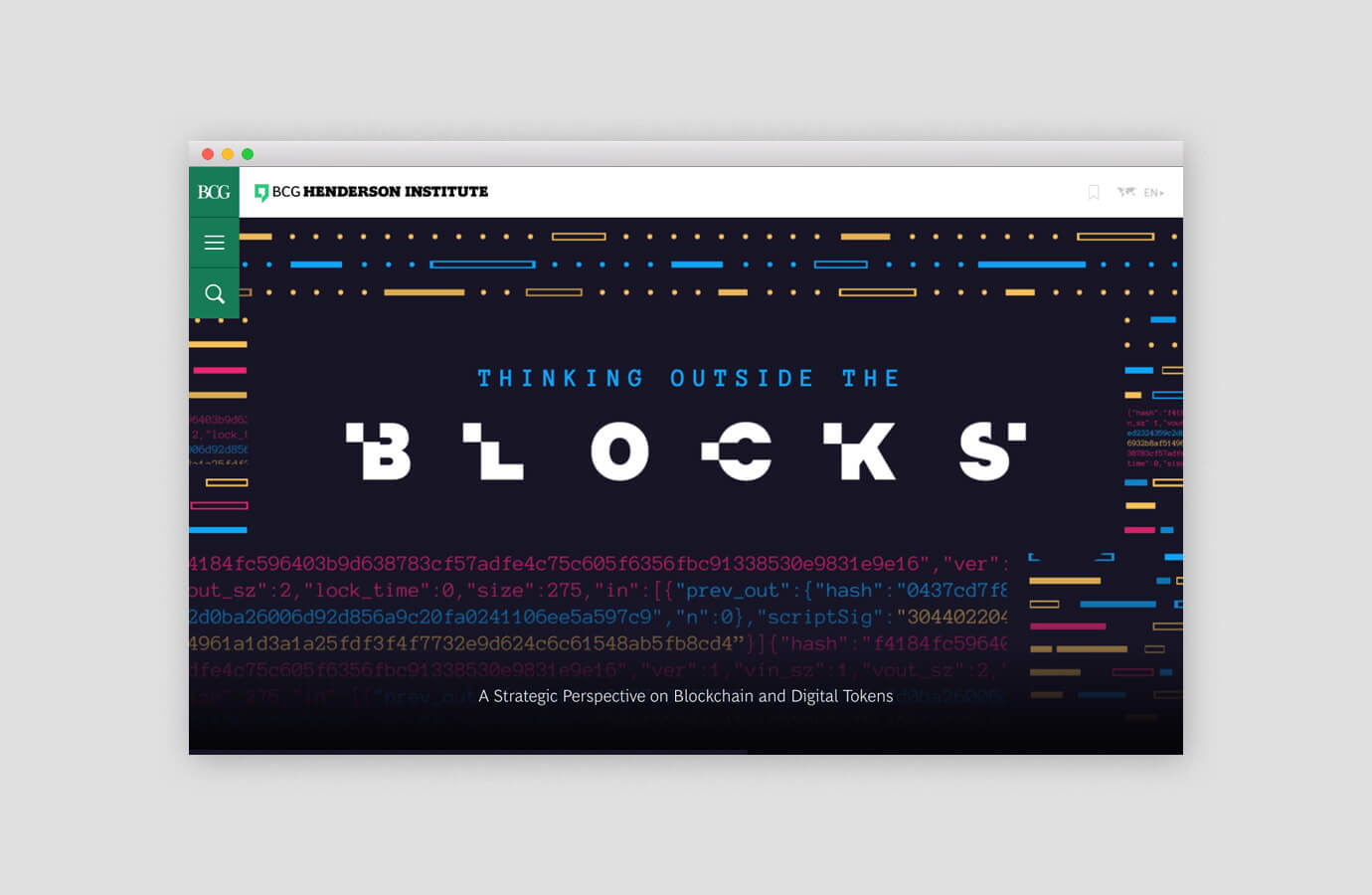
Spot illustrations help to conceptually convey the content, but also break-up long bodies of text in a visually engaging way.

Skim or Dive Deep
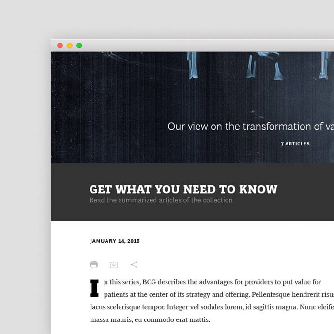
With an emphasis on time, we created a summary device called 'grok', an appropriated term from Robert A. Heinlein's Stranger in a Strange Land that means to 'get the gist of something'.
Grok offers the abiltiy to meaningfully link to a related story in the context of an article, but provide a summary so the user can keep going. The device is also used as a toggle to view collections, transforming a traditional view of articles into a list with a summary of each, saving the user valuable time.
We also extended this idea into a module on the homepage where BCG could 'grok' and outside article they were reading.
Illustrative Typography
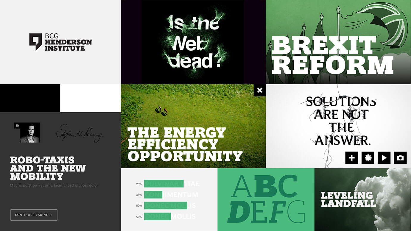
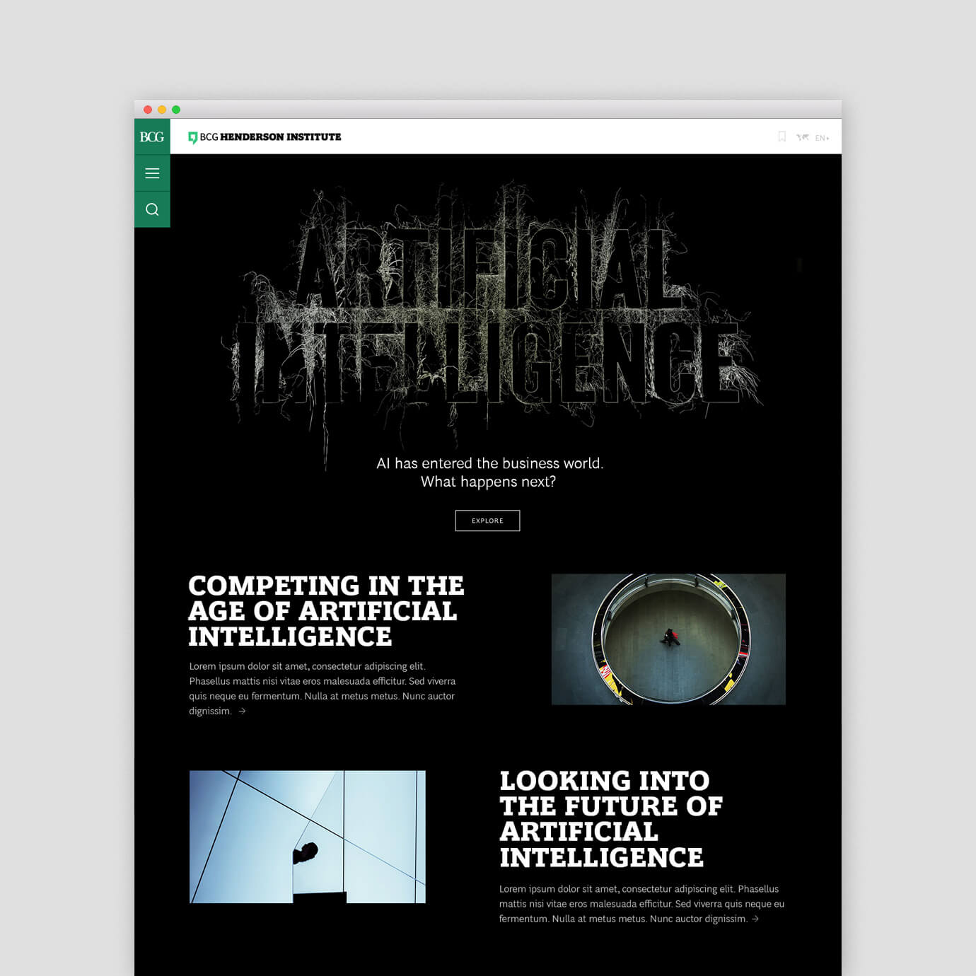
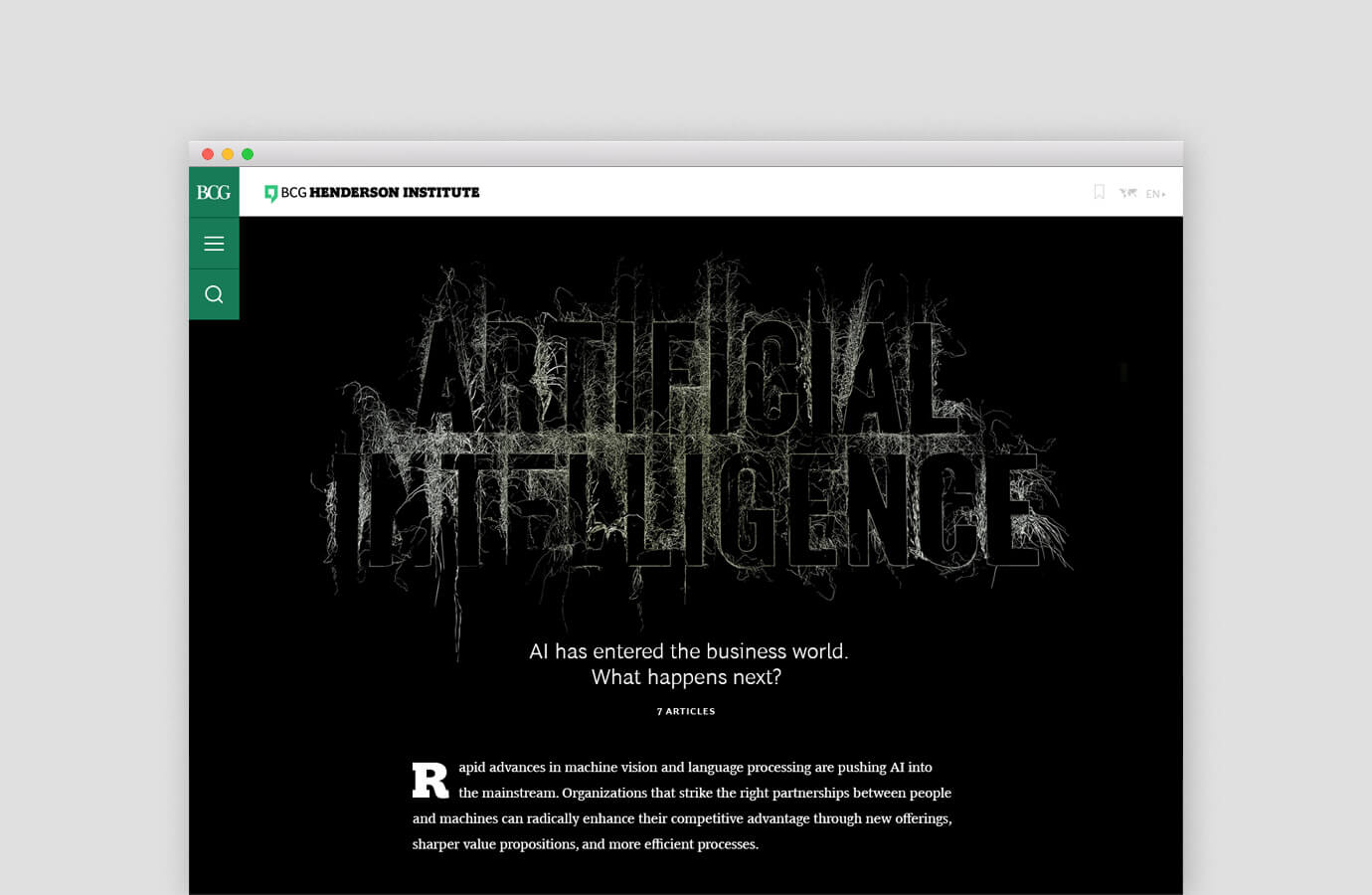
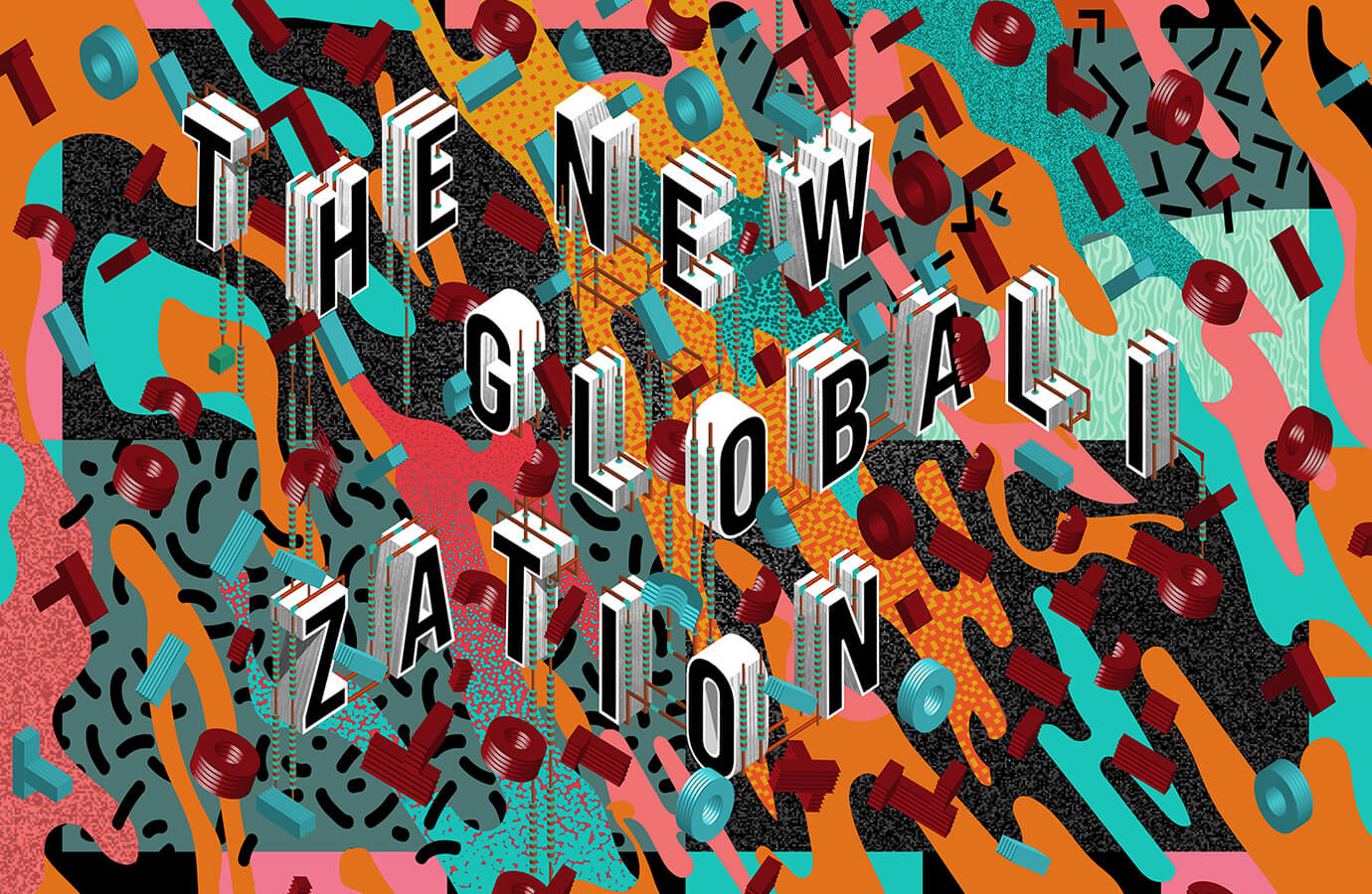
Due to the complex nature of the stories and themes, we knew bland business phtoography wouldn't suffice. Instead, we pushed BCG toward an idea of illustrative typography, showcasing the voice as the visual. This gave artsits we collaborated with such as Craig Ward and André Beato the freedom to express the ideas in meaningful, engaging ways that were truly unique to BCG.

I worked on this project as the design director, UX lead, and content strategist. However, a project of this scale doesn't get done without a great team, and I was grateful to lead one of the best groups I've ever worked with.
Creative Director
Kimiyo Nakatsui
Project Management
Katie Sharrow-Reabe, Terrence Sanchez
Design
Daniel Irizarry, Sarah Morgan, Nicholas Stover, Helen Dear
Strategy
Pete Meyers, Tricia DelGaudio