Jesse Kidwell
User Experience
Design
Development
Striking out on his own after three years working at Pentagram, Jesse Kidwell was looking for a website that gave careful control of layout and typography to showcase his work. The solution utilized fluid typography and a series of classes for responsive layout of images.
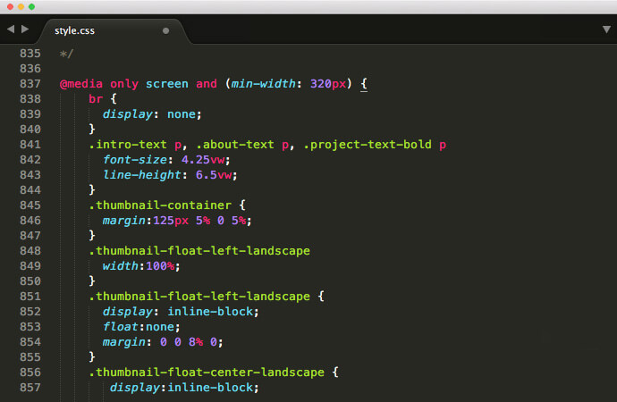
Fluid Typography
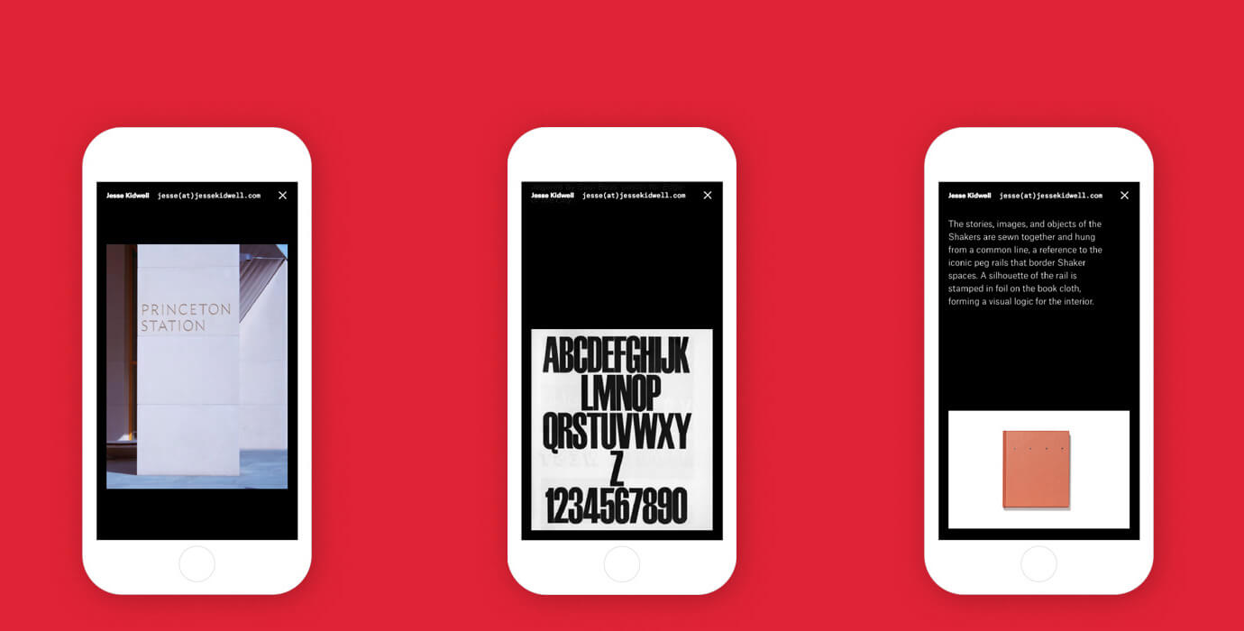
A system of typography based on the user's viewport width allowed for careful control of the type size and line breaks across mutliple devices.
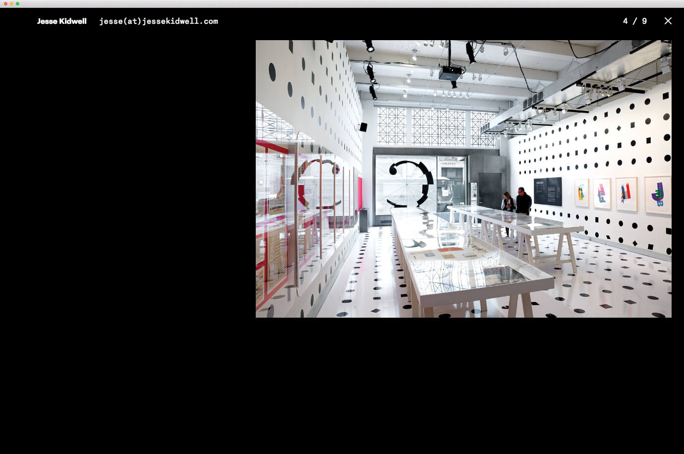
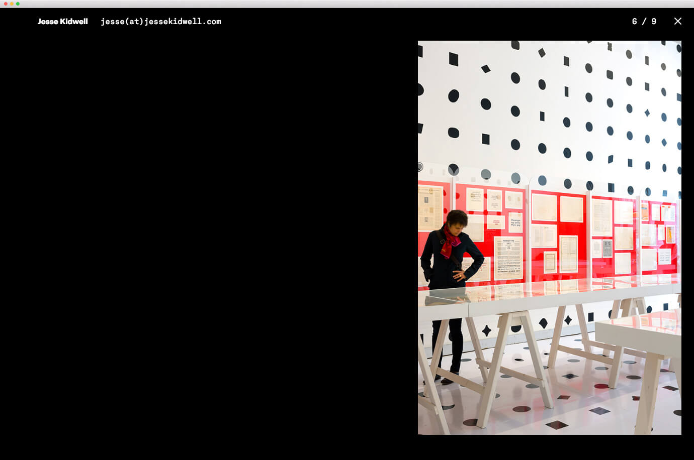
Responsive Layouts
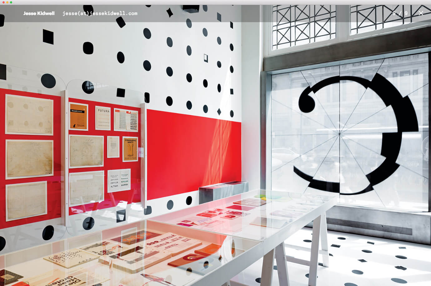
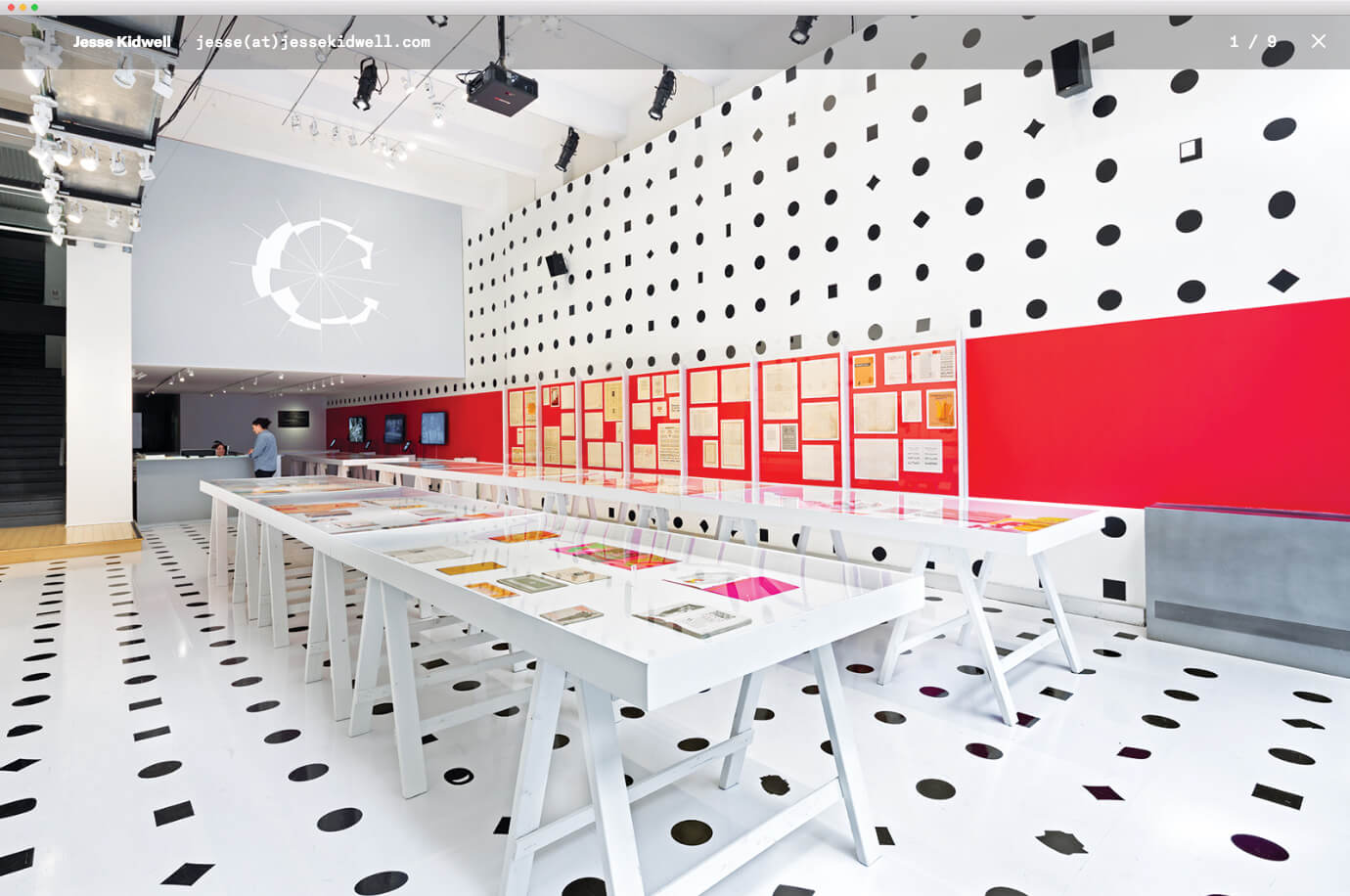
Depending on size and orientation, a series of classes were created in order to control the placement of type and each image on the page, allowing for a diverse layout.